2. Font Contrast |
||
Good slide |
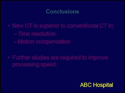
Inappropriate slide |
|
 |
 |
|
|
- Use high-contrast with colors for text relative to its background
- Bright letters on dark background (for example, white or yellow vs. blue) or dark letters on bright background (for example, red vs. white) - Simple is best |
|
- Inappropriate example of low contrast
- Dark letters on dark background, or Bright letters on bright background (For example, red vs. blue) (For example, yellow vs. white) - No nonsense sentences - Excessive emphasis of Logo or Hospital name is not appropriate for presentation slides. * Be careful in your use of colors; some people are red-green color blind and some colors do not stand out in contrast to others. |