9. Table Format |
||
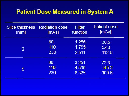
Good slide |
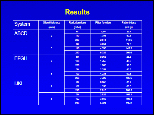
Inappropriate slide |
|
 |
 |
|
|
- Display only selected data
- Try to illustrate a graph instead of a complex table - Do not use vertical lines - Use color only for highlight |
|
- Inappropriate example of Table
- Too small font size - Too many data - Vertical lines may not be required in Table - Need acurate explanation for slide title ->Try to express your data in a graph or separate tables |